Website Copywriting and Content Strategy
All New Product Detail Page
I shaped the narrative for Dun & Bradstreet’s Credit Insights product page, translating a complex financial offering into clear, accessible value for both B2C and B2B audiences.
Grounded in research and close collaboration with stakeholders, the page connects product capabilities to real business challenges — balancing strategic positioning with the technical detail small business customers need to make informed decisions. The result was concise, persuasive content designed to build trust, drive engagement, and support a successful product launch.
The Redesigned Synaptiq Website
Synaptiq focuses on the humankind of AI; building a better world as they lean into an age of human and machine interaction.
They believe solving serious challenges, making a real impact, and saving lives are worth every waking moment. So they collaborate and make thoughtful considerations across disciplines examining past, present, and future models of merit. Whether history, science, math, nature, human behavior; they all inform the data and ideas that help clients find answers to world-class riddles.
However, Synaptiq’s global reputation for solving the most challenging problems for businesses using strategic AI solutions wasn’t enough. They needed a new website to demonstrate how they’re collaborating and making thoughtful considerations across disciplines while examining past, present, and future models of merit.
We began with brand discovery and by redesigning their voice and tone principle, focused on showing why their hearts and minds are in this for good. Next, we analyzed detailed accounts and conversations with sales and service, data, and consumer groups. We then organized user journeys with case studies, marrying social proof with happy partners and clients. The result is a clear and concise website where new and returning partners can see real value from Synaptiq’s approach and project-based mindset.
What's Up With D-U-N-S Campaign Landing Page
Over 500 million businesses have a Dun & Bradstreet D-U-N-S Number worldwide. Even so, too many current and aspiring small business founders don't understand the identifier—what it does and why it's valuable. Prior communication attempts were overly professional, missing a personal and targeted message.
To improve message clarity, we designed the 'What's up With D-U-N-S?' content theme: a dedicated landing page with internal linking to and from other D-U-N-S related informational pages. The theme selection is a result of community research on reddit, TikTok, and YouTube. Too many small business owners share their misunderstandings of D&B's identifier on these platforms with little guidance. Rather than become defensive, we joined the social media fun, using sarcasm and humor to explain the identifier's value. The following messaging and content represents my verbal design, creative strategy, and content strategy, including producing the feature video and content journey down the page.
Product Pages
Here, I partnered with the product and sales enablement teams to refresh the D&B Concierge Service product detail page. I first developed a new messaging guide, which clarified the product positioning as a premium, hands-on offering for established small businesses seeking expert assistance with credit health, reputation risk, and growth strategy. Then, I produced two customer case studies, demonstrating proof and validation through real business outcomes.
The refreshed page achieved it’s goal of combining authority (D&B), emotional reassurance, premium framing to sell the outcome of confidence and expertise. The resulting page influenced a sustained increase in qualified customers and steep decrease in call duration.
The Cisco Marketing Services team envisioned updated product pages with clear, concise, and informational messaging from top to bottom. They we're lacking a narrative and proof. I partnered with product marketing managers and sales members across the organization to unearth the human benefits customers verbally documented as "game-changing" to their professional lives. Together, we crafted clear and concise copy to tell a complete product story.
Landing Pages
Synaptiq, a full-scale artificial intelligence consultancy, needed a landing page to greet highly targeted visitors from an industry partner's email campaign. Synaptiq wanted to collect project inquires (lead generation) from the partner referrals. The constraints included a quick turnaround and minimal development, using only their current WordPress theme.
Event landing pages for the 2022 Cisco CX Break Away Series. During each event, a select few Cisco sales employees were chosen (by peers) to attend special engagement events, where they'd enjoy time with McLaren F1 or a world-renowned whiskey expert. The landing pages were a source of truth for the event information and registration process.
Clickable Banners
Headlines with CTAs (Trigger for Landing Page)
In 2021, Illumina’s focus shifted from SARS-CoV-2 testing to genomic surveillance for all variants globally. As a verbal designer for Illumina’s global creative studio, I interviewed regional product teams to understand how customers, partners, and the public spoke about the pandemic and, more specifically, COVID-19. The answers led me to the right words and phrases for impactful headlines and sub-headlines.
Here are two primary examples of creating effective landing pages using specificity, urgency, and proof points unique to the company. Each sample carries Illumina’s brand voice experienced across our integrated campaigns.
Full-Page Ad for Digital and Print
Digital Brochure Cover
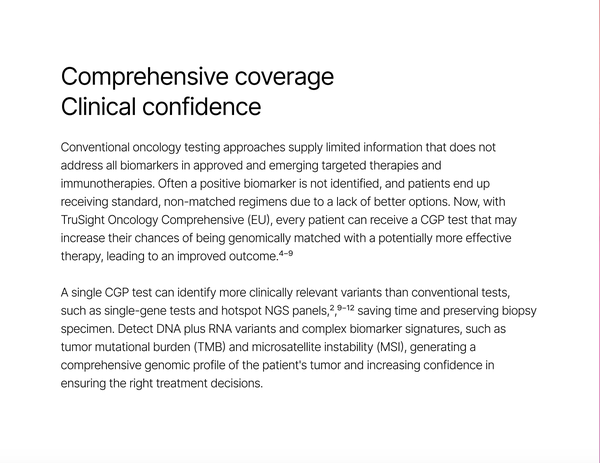
I partnered with Illumina's TruSight Oncology product team and a visual designer to craft the voice and tone for a new product brochure. I communicated a message of empowerment and positive progress, focusing on how we are making genomics useful for all while creating the future of cancer testing.


